A slow site does not lose visitors gradually. It loses them at the moment they decide it is not worth waiting, which on a phone happens fast. And the people you lose are the ones who arrived from search — the ones you worked hardest to get.
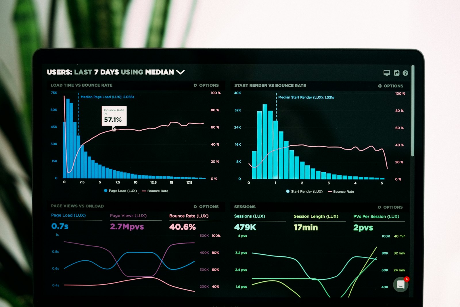
Measure first, and measure on a phone
Before touching anything, get a baseline. Run PageSpeed Insights on the mobile tab, not desktop — desktop scores flatter you and almost nobody visits that way. Ignore the headline number and read two things instead: the field data, which comes from real Chrome users, and the breakdown of what is actually taking time.
- Largest Contentful Paint: how long until the main thing on screen appears. Under 2.5 seconds is the target.
- Interaction to Next Paint: how quickly the page responds when someone taps. This is the one heavy JavaScript ruins.
- Cumulative Layout Shift: how much the page jumps around while loading. Usually caused by images without declared dimensions.
- Time to First Byte: how long the server takes to answer at all. If this is bad, nothing else you do will help much.
Images: where most of the weight is
On a typical business site, images are the majority of the page weight, and most of that is avoidable. A photo straight off a phone can be several megabytes and four thousand pixels wide, displayed in a slot eight hundred pixels across. You are sending five times the data for no visible benefit.
| Format | When to use it | Roughly how it compares |
|---|---|---|
| JPEG | Fallback for very old browsers | The baseline |
| WebP | Default choice today, supported everywhere that matters | Noticeably smaller than JPEG at the same quality |
| AVIF | Best compression, slower to encode | Smaller again than WebP |
| PNG | Only for logos and graphics needing transparency | Heavy for photographs — avoid |
| SVG | Logos, icons, simple illustrations | Tiny, and sharp at any size |
- Resize every image to the largest size it will ever be displayed at. Nothing more.
- Convert to WebP, or AVIF with a WebP fallback.
- Serve different sizes to different screens using srcset, so phones do not download the desktop version.
- Add width and height attributes so the browser reserves the space and the page stops jumping.
- Lazy-load everything below the fold — but never the main image at the top, which should load first.
Do the images first. On most sites this single step gives a bigger improvement than everything else on this page combined, and it carries no risk of breaking anything.
Caching
Caching means not rebuilding work that has already been done. There are three layers and they solve different problems:
- Browser caching: the visitor's own browser keeps a copy of your CSS, fonts and images, so the second page they open is nearly instant. Controlled by response headers.
- Page caching: the server saves the finished HTML instead of assembling it from the database on every request. On WordPress this is the single biggest server-side win.
- Object caching: stores the results of repeated database queries. Matters on shops and busy sites, not much on a brochure site.
One warning: caching hides problems rather than removing them. A cached page is fast for anonymous visitors and still slow in the admin area, in a shopping cart, or in search results — anywhere the cache cannot apply. If those feel sluggish, the underlying site is slow and caching is masking it.
JavaScript and CSS
Minification strips spaces and comments from your code. It helps, it is free, and it is also the least significant thing on this list. What actually costs you is loading code you never use.
- Remove plugins you are not using. Many load their scripts on every single page in order to be used on one.
- Defer scripts that are not needed to render the page. Anything analytics-related belongs in this group.
- Load fonts with font-display: swap so text is readable while the font arrives, instead of showing nothing.
- Cut the number of font weights. Each one is a separate file; three weights is usually plenty.
- Check whether your theme is loading a full icon library so you can use four icons.
The server
If Time to First Byte is above about 600 milliseconds, the problem is upstream of everything else and no amount of image optimisation will fix it.
- Server location: distance is time. If your customers are in Spain, the server should be in Spain or nearby — Madrid, France, Germany. Serving Spanish visitors from the United States adds a delay you cannot optimise away.
- Disk type: NVMe over SATA SSD. It shows up wherever the cache does not apply.
- PHP version: a current, supported version is meaningfully faster than one several releases old, and still receives security patches.
- A CDN, if you sell outside your own region. If your visitors and your server are both in Spain, it adds less than people expect.
The order to do it in
| Step | Effort | Typical payoff |
|---|---|---|
| Compress and resize images | Low | Large |
| Enable page caching | Low | Large |
| Remove unused plugins and scripts | Medium | Large |
| Fix font loading | Low | Medium |
| Defer non-critical JavaScript | Medium | Medium |
| Move to better hosting | High | Varies — measure first |
| Minify CSS and JS | Low | Small |
Work down that list and re-measure after each step. People routinely change five things at once, see an improvement, and have no idea which change caused it — which means they cannot repeat it next time.
Chasing a score of 100 is not worth it. Going from 40 to 85 changes how the site feels to real people; going from 85 to 100 mostly changes a number in a tool, and often means removing things that were earning their place.